Help students register for a life-changing experience
The Challenge: The Urbana Conference registration journey was showing a 60% abandonment rate just at the moment a person was beginning registration. What was going on?
The Goal: Surface the problem and re-design the journey to make sure users had the information they needed to successfully register.
My Role: Web Designer

Discovery
First, it was critical to visualize the registration journey and pinpoint what was happening.

We didn’t have a robust digital marketing journey and data analytics system set up, so I had to manually gather information from:
social media analytics
website analytics
registration system analytics
and Hotjar analytics
What was going wrong?
While I would have loved to gather some students for direct feedback, I was able to gather a team of 9 people from marketing, social media, communications, and the Urbana leadership to be part of the ideation team.
Prior to the ideation and seeing the data, many sent over to me what they thought should be done - most wanted to revamp the homepage. But if we had surged forward without doing the data analysis, that would have been a mistake.

The Hot Jar user interaction data showed that users weren’t scrolling the homepage at all - they were heading straight to the About page, presumably to find out more information about the conference.
ISSUE #1
Users didn’t find the information they were looking for where they expected it to be.

Analyzing the paths
The second set of ideas that came to me before the data and ideation time had to do with improving the registration form itself. But it turned out that the largest drop happened not in filling out registration, but after indicating intent to register. Why?
HYPOTHESIS
Students didn’t have the information they needed, went to registration to see if they would find out more, didn’t find it, and gave up.
Armed with better information about the user patterns, we began pulling together ideas.


Design
As a project lead, I have found it’s most effective to harness great ideas from the many and refine with a few.
I gathered our Director of Communications and Director of Digital for input and crafted the recommendation for the Urbana leadership team that we would fix the paths and surface key information.
Light redesign the About page to emphasize current conference information.
Take the program content from the Conference page and move to new Program page.
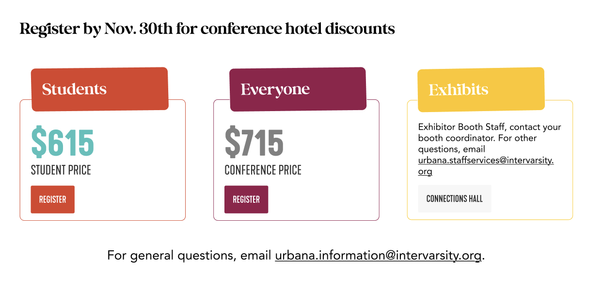
Removing program content gave better visibility of key information like price, location, housing, travel, etc. on the Conference page.
Update the Registration page to have key information and easier way to get started on registration.


Deliver
After implementing the recommended changes, we checked in on the conversion rate (and yes, I re-gathered all that data again manually)


Hallelujah!
The changes seemed to indicate that fixing the paths to point to the newly surfaced key information earlier in the potential attendee’s journey mean that they were much better informed and ready to register.

Reflection
You have to pay attention to what users are seeing where in their journey.
I am thrilled that this year’s Urbana is taking seriously the need to be upfront about logistical details like pricing and travel that are crucial for students to make a decision about coming to Urbana.


